L O A D I N G

3D Mobile App Icon: Touchpoint for Navigation

Icons play an essential role in mobile apps as navigation markers for users. Because of their importance, icons are not just for aesthetics. They carry meaning and serve as touchpoints that guide user interaction.

Category
Digital Asset Design
Client
Citilink Indonesia
Project Date
July 2022
Industry
Airlines

Project Description

The creation of these design elements a set of icons was part of the Citilink app development project focused on improving its User Interface and User Experience. These icons serve as visual touchpoints on the home screen, guiding users through their journey while representing Citilink’s key services and products in a clear and engaging way.

Project Focus

The main focus of this project was to create a set of icons for the home screen that represent Citilink’s services and products designed to be scalable without losing their visual identity. both offline and digital media ensuring every touchpoint reflected the same fresh yet professional tone.

Creative Direction

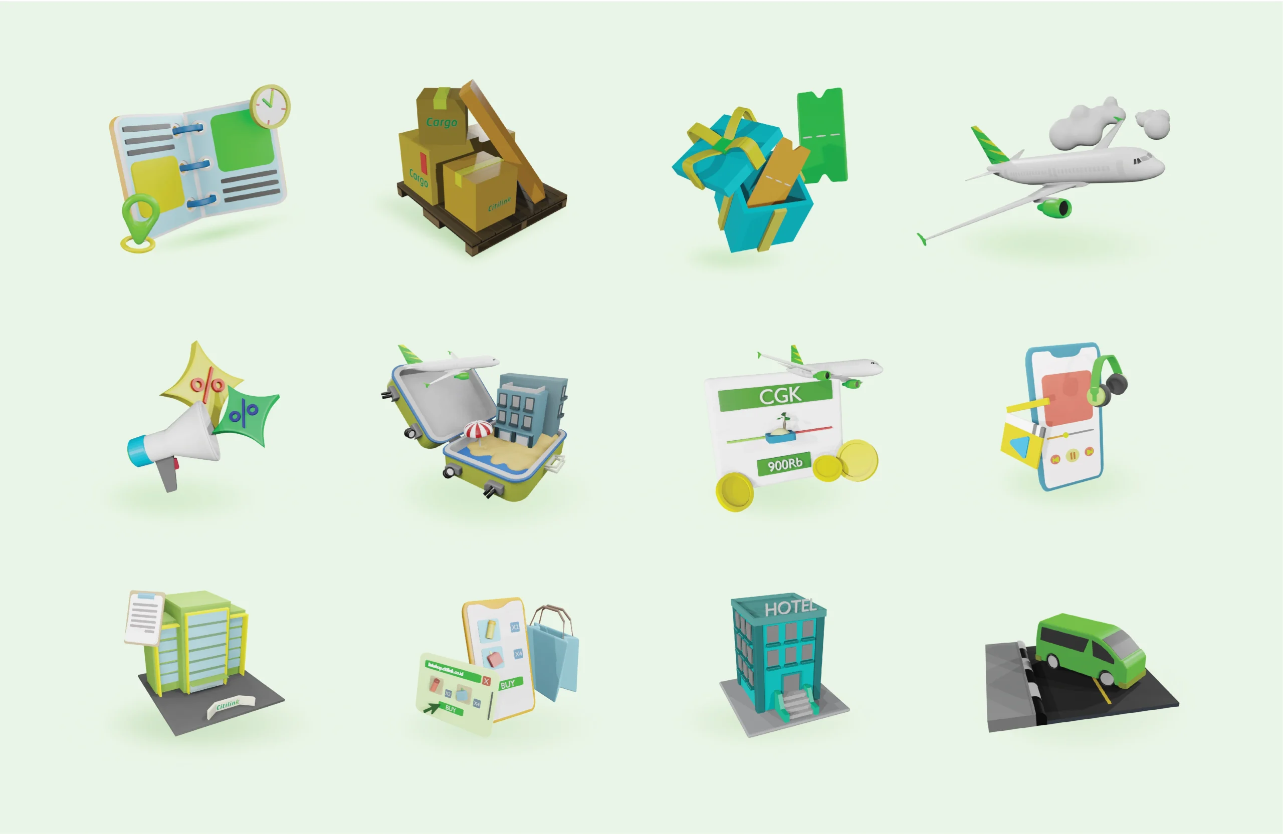
To create a strong touchpoint, each icon needed to share a consistent visual identity.
The background of every icon was designed with meaning reflecting both the company’s values and aspirations.

A 3D visual approach was chosen to give each icon more depth and clarity. Since icons play an important role as visual symbols of information and appear in different sizes across screens, a dimensional and straightforward form was the right choice.

At the same time, the visuals were carefully aligned with Citilink’s existing brand guidelines to ensure a cohesive look across the new app interface.